
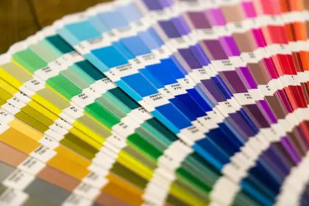
A packaging design can look immaculate on screen and still develop problems when it reaches production. Colours may appear different on the printed board, fine text can become difficult to read, a logo may sit awkwardly across a fold, or a barcode might fail to scan. These issues are not always caused by poor design; sometimes, the artwork simply has not been prepared for the printing and packaging process.
Preparing print-ready artwork bridges the gap between a creative concept and a finished product. It brings together graphic design, colour management, technical specifications and structural planning to help ensure the design works on the actual packaging, not just on a computer screen.
Whether you’re designing custom tuck boxes for cosmetics, supplements, coffee, confectionery or retail products, this guide explains the essential steps, compares common production choices and shows how to identify potential problems before approving the final artwork.
What Does Print-Ready Artwork Actually Mean?
Print-ready artwork is a design file prepared to meet the technical requirements of a particular printing and packaging job. It should have the correct dimensions, layout, colours, images, fonts and production settings specified by our team.
Packaging involves more than printing a flat design. The material may be printed, cut, creased, folded and glued before it becomes a finished box. The artwork must account for these processes so that graphics appear in the right places and essential information remains readable.
Artwork vs dieline vs mock-up
| Term | What it means | Example |
|---|---|---|
| Artwork | The visual design and printed information | Logo, product name, photographs and brand colours |
| Dieline | The technical template showing cuts, folds and construction | The flat layout for a skincare carton |
| Mock-up | A visual or physical representation of the proposed box | A 3D rendering or folded sample |
| Proof | A version prepared for review and approval | A PDF showing the proposed design |
| Production file | The file or collection of files prepared for manufacture | The approved PDF and required production assets |
A mock-up helps you visualise the packaging, but it does not automatically confirm that the artwork is technically correct. A proof must be checked for content and layout, while a physical sample can reveal construction and material issues that are harder to judge on screen.
As Esko’s packaging prepress guide explains, prepress can include file checking, colour management, structural verification and preparing output for the chosen print process.
1. Start With the Correct Dieline
Before designing the box, obtain the approved dieline from our team. It should match the agreed packaging style, dimensions and construction.
A straight tuck end box, reverse tuck end box and auto-lock bottom box have different panel arrangements. Even two cartons of the same general style can need different templates because their dimensions and closures differ.
What should you look for?
| Dieline feature | Purpose | Artwork consideration |
|---|---|---|
| Cut lines | Show where the material will be cut | Keep essential details clear of cut edges |
| Crease or fold lines | Show where the material will bend | Avoid placing important text across folds |
| Glue areas | Identify where adhesive will be applied | Follow our instructions for these zones |
| Bleed boundary | Show how far artwork must extend beyond the cut edge | Extend eligible backgrounds to the specified boundary |
| Safe area | Mark the recommended space for important content | Keep logos and critical text clear of edges |
| Panel boundaries | Identify the box’s front, back, sides and flaps | Position artwork for the assembled pack |
Keep the dieline on its own labelled layer if your design software allows it. Follow our instructions for how the technical lines should be handled in the final export.
Do not resize, rotate or redraw the template without approval. A small structural change can affect the way the box closes and the way the artwork aligns.
Match the artwork to the packaging style
| Packaging type | Typical application | Main artwork priority |
|---|---|---|
| Straight or reverse tuck end box | Lightweight retail cartons | Correct panel orientation and closure layout |
| Auto-lock bottom box | Products needing a suitable self-forming base | Clear space around the base and glue areas |
| Window box | Products displayed partly through a cut-out | Align the design around the window |
| Printed sleeve | Products wrapped by an outer band | Check overlap, seam and visible front panel |
| Mailer box | E-commerce orders and subscription kits | Plan exterior, interior and closure graphics |
| Folding carton with insert | Products held in a shaped insert | Coordinate the artwork with the product and insert position |
The product, weight, dimensions, filling method and protection requirements should inform the packaging choice. Once the structure has been agreed, the artwork can be designed around it.
2. Understand Bleed, Trim and Safe Areas
Bleed, trim and safe areas solve different problems and should not be treated as interchangeable terms.
Bleed is the extra artwork beyond the intended cutting edge. It helps prevent an unwanted unprinted strip from appearing if the cut varies slightly.
Trim is the intended finished edge after cutting.
The safe area is the space inside the trim where essential information should remain clear of cuts, folds and other structural features.
A simple bleed calculation
Suppose a rectangular panel measures 100 × 150 mm and our team specifies 3 mm of bleed on every side.
| Measurement | Calculation | Result |
|---|---|---|
| Width including bleed | 100 + 3 + 3 | 106 mm |
| Height including bleed | 150 + 3 + 3 | 156 mm |
This is an illustrative calculation, not a universal packaging specification. Real dielines contain multiple panels, flaps and irregular shapes, so always follow the actual template and our instructions.
Imagine a dark-green background that stops exactly at the trim line. If the cut falls slightly inside the artwork, a narrow strip of unprinted material could become visible. Extending the background into the bleed area helps reduce this risk.
| Feature | Bleed | Safe area |
|---|---|---|
| Position | Outside the intended cut edge | Inside the intended cut edge |
| Purpose | Helps backgrounds reach the finished edge | Protects important content |
| Suitable elements | Background colours and images intended to run to the edge | Logos, product names, instructions and critical symbols |
| Common mistake | Stopping a background at the trim line | Putting essential details too close to a cut or fold |
Do not automatically apply a fixed margin to every box. The correct clearances depend on the dieline, construction and our production tolerances.
3. RGB, CMYK and Pantone: Which Should You Use?
Colours displayed on a screen can look different from colours printed on packaging. Screens produce colour using light, while printed results depend on inks, material and the printing process.
Colour systems compared
| Feature | RGB | CMYK | Pantone or other spot colour |
|---|---|---|---|
| Main use | Screens and digital displays | Many process-colour print jobs | Specified colours in suitable spot-colour workflows |
| How it works | Combines red, green and blue light | Combines cyan, magenta, yellow and black inks | Uses a defined colour reference and, where applicable, a designated ink |
| Main advantage | Supports vivid screen colours | Commonly used for full-colour print | Helps communicate specific brand-colour requirements |
| Main limitation | Some screen colours cannot be reproduced exactly in print | Some colours may look less vivid than on screen | The final appearance still depends on the material and print process |
CMYK is common, but it is not the only possible setup. Some jobs require spot colours or specific colour profiles. Confirm the production requirements with our team before changing colour settings or exporting artwork.
Why material matters
A colour printed on smooth white board may look different from the same design printed on brown kraft-style board. The material’s surface and base colour influence the final appearance.
For a brand that relies on a precise shade, record the approved colour reference, confirm the intended material and ask us whether a suitable colour proof or sample is available.
Pantone’s explanation of coated and uncoated colour references is useful when considering how paper surfaces affect colour appearance.
Do not assume that converting a file to CMYK guarantees a perfect match. Colour management must reflect the intended output conditions, and a screen preview cannot reproduce every aspect of physical print.
4. Image Resolution: How Much Detail Is Enough?
An image may look sharp on a phone but appear blurry when enlarged across a packaging panel. What matters is the image’s effective resolution at the final printed size, not simply its file size.
PPI means pixels per inch, while DPI refers to printer dots per inch. The terms are sometimes used interchangeably in everyday print conversations, but they describe different things.
Around 300 PPI at the final printed size is a common starting point for photographic artwork. It is not a universal rule for every image or packaging process; confirm our specification.
Worked example: a 600-pixel image
Suppose you have a photograph that is 600 pixels wide and want to print it across a 100 mm panel.
100 mm ÷ 25.4 ≈ 3.94 inches
600 pixels ÷ 3.94 inches ≈ 152 PPI
At that size, the image would have an effective resolution of approximately 152 PPI.
| Printed width | Approximate effective resolution |
|---|---|
| 25 mm | 610 PPI |
| 50 mm | 305 PPI |
| 75 mm | 203 PPI |
| 100 mm | 152 PPI |
| 150 mm | 102 PPI |
This calculation assumes the same 600-pixel-wide image and illustrates how effective resolution falls as the image is enlarged. Whether the result is acceptable depends on the image and print requirements.
Increasing an image’s resolution setting in software does not automatically restore detail that was never captured. Whenever possible, use the original high-resolution photograph or vector logo.
Vector vs raster artwork
| Feature | Vector | Raster |
|---|---|---|
| Structure | Paths, shapes and curves | A grid of pixels |
| Typical examples | Logos, icons and line illustrations | Photographs and textured artwork |
| Resizing | Usually scales cleanly | Enlarging too far can cause pixelation |
| Common formats | AI, EPS and suitable PDFs | TIFF, PNG, JPEG and PSD |
| Main check | File compatibility, fonts and effects | Pixel dimensions and effective resolution |
A print-ready PDF can contain both vector and raster elements. The file extension alone does not guarantee that the artwork is suitable for production.
5. Which Artwork File Format Is Best?
The right format depends on our workflow. Some require a print-ready PDF, while others request editable source files or a collection of supporting assets.
| Format | Best suited to | Important checks |
|---|---|---|
| Final artwork and proofing | Bleed, colour settings, fonts and required PDF standard | |
| AI | Editable vector design | Linked images, fonts and compatibility |
| EPS | Certain vector graphics and production assets | Software support and handling of effects |
| TIFF | High-quality raster images | Resolution, colour setup and file size |
| PNG | Digital assets with transparency | Resolution at the intended print size |
| JPEG | Photographs | Compression artefacts and image quality |
| SVG | Scalable vector graphics | Whether we accept it or require conversion |
A PDF is not automatically print-ready simply because it opens correctly. It must still meet our technical requirements.
Adobe’s official PDF preparation guide explains how to prepare PDFs for printing, including PDF/X workflows. Confirm the required format and settings with our team rather than applying generic export settings blindly.
Prepare fonts and linked files
Your design may rely on fonts or images stored outside the main working file. If those assets are missing, the artwork could display incorrectly on another system.
We may ask you to embed fonts or outline them. Outlining converts text into vector shapes, making the wording less convenient to edit. Keep an editable master file before outlining, and package linked assets as instructed.
Use clear file names such as FaceCream_50ml_Box_v04_Approved.pdf instead of confusing names such as Final_Final_New2.pdf. Keep approved artwork separate from older versions.
6. Typography, Barcodes and Product Information
Packaging typography must look distinctive while remaining easy to read at the actual size of the finished box. A line of text that seems comfortable when enlarged on a screen may be difficult to read on a small carton.
Check type size, spacing, contrast and alignment. Fine lettering, small reversed-out text and details close to folds deserve particular attention.
There is no single font size suitable for every packaging job. Requirements depend on the design, print process and product. Where mandatory labelling rules apply, they must be checked separately.
Barcode vs QR code
| Consideration | Product barcode | QR code |
|---|---|---|
| Typical purpose | Identifies a product in compatible scanning systems | Links to digital content or other encoded information |
| Main concern | Correct symbol data, size, contrast and clear space | Correct destination, sufficient contrast and undistorted shape |
| Common mistake | Adding graphics too close to the symbol | Placing the code over a fold or using a poor-quality image |
| Final check | Confirm the data and test scanning | Scan the code and verify the destination |
GS1’s barcode quality guidance highlights correct data, quiet zones, contrast, symbol dimensions and placement. Quiet zones are the clear areas around a barcode that help scanning equipment identify the symbol.
Generate codes correctly and avoid resizing them casually. Keep them away from folds, cut-outs and areas that may become obstructed, and test the approved artwork or a representative sample.
Product information must be approved
Different packaging categories need different information. A food carton may require ingredients, allergen details, net quantity or other information, while an electronic accessory may need model or compatibility details.
For food products in the UK, GOV.UK’s food labelling overview explains that information must be clear, visible, easy to understand and not misleading. Requirements depend on the type of product and its circumstances.
Obtain approved wording before finalising the design. Do not shrink text until everything fits or add regulatory symbols and environmental claims without confirming that their use is appropriate.
7. Special Finishes and Material Choices
Foil, embossing, debossing, spot UV and other finishes can add a distinctive visual or tactile element. They may also require separate production instructions, layers or artwork files.
| Finish | Visual effect | Artwork consideration |
|---|---|---|
| Foil blocking | Reflective metallic or coloured area | Identify the exact foil area and specified finish |
| Embossing | Raised surface | Confirm placement and minimum-detail requirements |
| Debossing | Pressed-in surface | Check alignment with the printed artwork |
| Spot UV | Gloss applied to selected areas | Mark the coated area as instructed |
| Lamination | Film applied to the surface | Confirm the required finish and material compatibility |
| Varnish | Coating for a chosen surface effect or protection | Specify the type and extent of coverage |
Imagine a navy candle carton with a metallic logo and an embossed motif. The normal printed artwork needs to be distinguishable from the areas requiring additional treatment. Ask us to confirm how those areas must be labelled and whether the design’s fine details suit the intended process.
White board vs kraft-style board
| Consideration | White board | Brown kraft-style board |
|---|---|---|
| Base appearance | Light background for printed colours | Brown base can influence colour appearance |
| Design approach | Often suited to colour-led graphics and photography | Can suit natural-looking graphics and restrained palettes |
| Colour checks | Confirm the print specification and proof | Pay particular attention to colour contrast on the actual substrate |
| White areas | May use the board’s natural colour, depending on construction | White may require a specific printing treatment |
| Main risk | Assuming screen colour will match the final print | Expecting pale colours to appear as they would on white |
These are general comparisons; the actual result depends on the material, coating, ink and print process. If a brand colour is central to the design, ask about a proof or sample on the intended material.
8. Packaging Design Directions Worth Exploring
Current print-industry discussions include personalised packaging, variable data, distinctive finishes and digital connections such as QR codes. These approaches are opportunities to consider, not trends that every brand needs to follow.
FESPA’s article on personalisation in print discusses variable data and versioned designs. The practical question is whether the approach suits the product and can be managed accurately.
| Design direction | Potential benefit | Artwork requirement |
|---|---|---|
| Personalised packaging | Different messages or versions for targeted campaigns | Control variable data, proof each version and use clear file names |
| QR codes | Connect customers to instructions or online content | Test the destination and keep the code readable |
| Tactile finishes | Add texture and visual distinction | Specify finish areas separately where required |
| Minimal, information-led layouts | Create a clear hierarchy and reduce visual clutter | Prioritise essential information and spacing |
| Product-range colour coding | Help distinguish product variants | Maintain consistent templates and check each version |
| Material-led design | Use the substrate as part of the visual identity | Check colour and contrast on the chosen material |
What the digital-print data tells us
Smithers estimates that the global digital packaging and label market was worth $22.0 billion in 2025, accounting for 4.1% of all printed packaging by value. It forecasts that the market will reach $36.9 billion by 2030, when digital printing is expected to account for 5.8% of printed packaging by value.
These are global market estimates and forecasts, not figures specifically for UK tuck boxes. They also do not establish that digital print is the best choice for every order. The useful lesson for artwork preparation is that multiple versions and changing designs need accurate information, organised files and controlled approval.
9. Proofing: What Should You Check Before Approval?
Proofing gives you an opportunity to identify errors before the artwork is released for production. The right proof depends on what you need to assess.
| Proof type | Useful for checking | Main limitation |
|---|---|---|
| Digital PDF proof | Wording, layout, artwork position and general design | Cannot guarantee the final printed colour |
| 3D mock-up | Panel orientation and how the design appears when assembled | Depends on the accuracy of the model |
| Structural sample | Dimensions, closure and fit | May not show final print or finishes |
| Printed sample | Appearance on a representative material | May not match the final production conditions unless specified |
| Controlled colour proof | Assessing colour against agreed conditions | Suitability depends on the project and the proofing options available for your order |
For example, a digital proof may reveal a spelling mistake, but it cannot fully demonstrate how an embossed logo will feel or how a particular shade will appear on kraft-style board.
Review the artwork in stages:
- Content: check product names, spelling, instructions, codes and approved product information.
- Structure: verify the dieline, panel orientation, folds, closures and glue areas.
- Visual quality: review colours, image sharpness, contrast and overall hierarchy.
- Technical setup: confirm bleed, fonts, colour settings, file format and finishing instructions.
- Final approval: make sure the authorised person has approved the correct version. If the file changes afterwards, confirm whether a revised proof is necessary.
10. Common Artwork Mistakes and How to Avoid Them
| Mistake | Possible consequence | Better approach |
|---|---|---|
| Using the wrong dieline | Panels or closures may not align | Start with the approved template |
| Forgetting bleed | Unprinted edges may become visible | Follow our bleed instructions |
| Placing text too close to folds | Content may become distorted or difficult to read | Keep critical details within the safe area |
| Using small web images | Photographs may appear blurry | Check effective resolution at final size |
| Assuming screen colours will match print | Brand colours may look different | Confirm colour settings and review a suitable proof |
| Leaving fonts or links unprepared | Text or graphics may render differently | Embed or outline fonts and package assets as instructed |
| Failing to identify special finishes | Production staff may misinterpret the intended effect | Supply clear finishing information |
| Approving without checking the content | Errors may proceed into production | Review text, codes and product details separately |
| Sending an outdated file | The wrong version may be manufactured | Name versions clearly and record approval |
Correct artwork reduces the risk of avoidable file-related problems, but it cannot guarantee a flawless result. Material behaviour, printing, cutting, folding and finishing also influence the finished pack.
Frequently Asked Questions
What is the best file format for packaging artwork?
A print-ready PDF is commonly used, but some suppliers also accept AI, EPS or other formats. Confirm the required file type and export settings before submitting your artwork.
How much bleed does packaging artwork need?
It depends on our specification and the dieline. Although 3 mm is used in some print workflows, do not assume it applies to every packaging job.
Should I use CMYK or RGB?
CMYK is common for process-colour printing, while RGB is primarily used for screens. Some projects use spot colours or specific colour profiles, so follow our instructions.
Is 300 PPI required for every image?
No. Approximately 300 PPI at final size is a common starting point for photographic artwork, but the appropriate resolution depends on the image, print process and our specification.
Can I use Canva for packaging design?
Canva can help develop a visual concept, but the exported file still needs to meet our requirements for dimensions, bleed, colour settings, image quality and dieline alignment.
Should I outline fonts before sending artwork?
We may ask you to outline or embed fonts. Follow our specified workflow and keep an editable master file before outlining text.
Can I put a barcode or QR code anywhere on the box?
No. Codes need suitable dimensions, contrast, clear space and placement. Avoid folds and cut-outs, and test the final code at the intended size.
Are digital proofs enough?
They are useful for checking content and layout, but they may not reveal the final material appearance or tactile finish. A physical sample or controlled proof may be appropriate for more demanding projects.
Can print-ready artwork guarantee perfect printing?
No. Proper preparation reduces avoidable artwork errors, but the final result also depends on materials and production conditions. Proofing and approval remain important.
What if my artwork is not print-ready?
Send us the current design, intended box dimensions, approved brand assets and product information. Ask what artwork checks or design-support services are available.
Sources and Further Reading
- Packaging prepress — Esko, “A Guide to the Full Packaging Prepress Process,” 4 June 2026. Supports the discussion of file checking, colour management, structural fit and preparing artwork for the chosen process. Read the guide.
- Print-ready PDFs — Adobe Acrobat, “Make PDFs print-ready with Acrobat Pro,” updated 7 June 2026. Explains PDF and PDF/X preparation. The correct export settings depend on the job requirements; confirm them with our team. Read Adobe’s guide.
- Colour references — Pantone Support, “What do the terms Coated and Uncoated mean in the Pantone Graphics System?” Explains why a colour can look different on coated and uncoated paper surfaces. Read Pantone’s explanation.
- Barcode quality — GS1, “What should I check to ensure good quality barcodes?”, modified 30 August 2024. Covers data accuracy, quiet zones, contrast, symbol dimensions and placement. Read the guidance.
- Food labelling — GOV.UK, “Food labelling and packaging: Overview.” Provides official guidance on clear and accurate food information, with links to detailed requirements. Read the overview.
- Digital packaging print — Smithers, “The Future of Digital Print for Packaging to 2030.” Provides global market estimates and forecasts; the figures quoted above are not specific to UK tuck boxes. Explore the report.
- Personalisation in print — FESPA, “Is Individuality the New Scale? How Personalisation is Driving Industry Growth.” Discusses variable data and versioned print applications, supporting the section on personalised artwork. Read the article.
Prepare Your Packaging Artwork With Confidence
Successful packaging artwork brings creative design and technical precision together. Start with the correct dieline, follow our colour and file requirements, use suitable images and fonts, and prepare any special finishes or codes carefully. Then review the proof against the actual product and make sure the approved file is clearly identified.
These steps help create a smoother path from design to production while reducing preventable errors. They also make communication with our team more productive because the technical requirements and approval expectations are clear.
Visit Custom Tuck Boxes UK to explore packaging options and discuss the requirements for your project.